How we created a new financial brand from the inside out
The UK wealth management branch of a South African global financial service group had just been acquired by a private equity firm. They wanted to seize this opportunity to reinvent themselves and create a bold, forward-looking business to outshine their competitors.
And so, our task was set; develop a new name and distinctive market positioning for this new company. One that would set them up with a solid foundation for future acquisitions—and excite their existing clients and employees about the journey ahead.

Insight
All good brand strategy starts with the same thing—research. After a host of workshops, stakeholder interviews, surveys and competitor analysis, it became clear that the financial planning and wealth management industry is, by and large, incredibly fragmented. Between a wealth of providers, products and services, people are constantly having to choose between one or another.

Strategy & Positioning
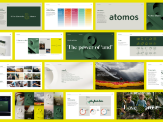
This industry tends to silo every facet of people’s finances, so we decided to turn convention on its head. What if we could offer complete financial well-being by offering the best of both worlds? In a disjointed financial market, this is the proposition that would help them stand out. This is the big idea underpinning the brand—it’s the power of ‘and’.
Naming
From an initial long list over 100 names, we consulted regularly with our client to whittle the options down to one that we all felt encapsulated the brand idea perfectly. Combining heritage and modernity, we chose an ancient Greek word that means uncuttable and indivisible. We chose ‘atomos’.


Visual & Verbal Identity
We then developed a visual and verbal identity to help our client communicate their brand idea through every element of their brand. A bold look and feel that combines sophistication and accessibility, a voice that combines intelligence and curiosity, and an overarching graphic device that combines brevity and comprehensiveness. That’s no mean feat!

Our new brand is more than just an updated identity, it’s the start of an exciting new chapter. This whole project has focussed on the needs and expectations of our clients and has been grounded in their feedback, as well as insights from our industry and our colleagues.
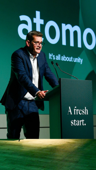
The response to our new name has been fantastic, and we look forward to building a modern and responsive business that makes the dreams and financial ambitions of our clients a reality.


