To Infinity and Beyond
Just like Buzz, we work hard, dream big and take ourselves and our clients to new heights.

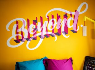
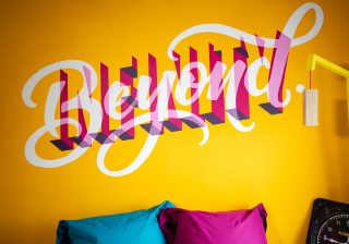
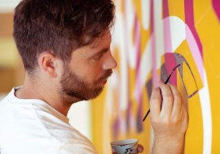
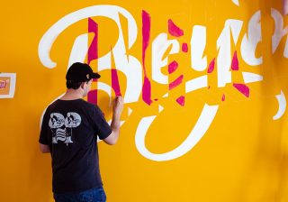
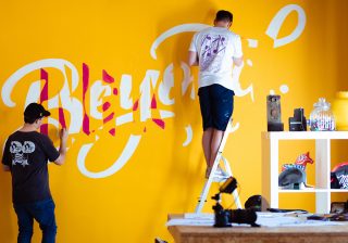
In case you missed it, we’ve been taking our brand values and making them super-size, by bringing them to life in the MadeBrave studio. Just as we got Richard Davies to draw all over one of our meeting rooms with ‘Amigos without Egos’ we thought it made sense to put ‘Infinity & Beyond’ right at our front door, with the help of lettering artist, Craig Black.
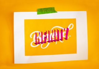
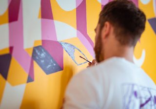
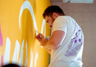
“When I was approached by MadeBrave regarding the value, it got me really excited as my mind started running crazy with ideas of how to push the boundaries of these letterforms. I wanted the lettering work to be a physical representation of the value, for instance the word ‘infinity’ is created in this three-dimensional negative space format with the idea that it can continue to grow out of the wall in this limitless way. The idea behind the lettering of ‘beyond’ was to show the word literally going ‘beyond’ the word ‘infinity’ and by combining the two lettering styles reveals countless possibilities.” — Craig Black
‘To infinity and beyond’ was probably the first value we ever had, it was even on the kitchen wall in our Southblock studio. For us, it’s all about pushing boundaries and going above and beyond what’s expected – not just to ‘surprise and delight’ but to continuously deliver the very best that we can. As a bunch of creative types, nothing excites us more than seeing a great idea come to life and the fact that people allow us to make that happen through their brand is why we jump of out of bed every morning (even when the heating isn’t on yet).
The ethos here is never accept mediocre, never accept normal, to just go and go and go. You might fail spectacularly, but you know, have a try and see what you can learn from it…Sometimes the brief that comes in, is already veering you down a certain path, but we can read it and go, that would be great to create you a brochure or a website or whatever, but we have this really great idea, and what do you think about doing this instead?
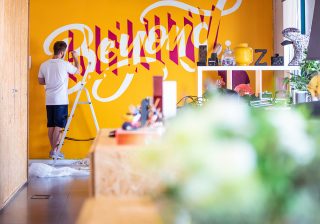
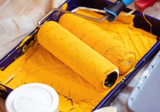
When it came to designing the mural, Craig kicked it old-school, with some pencil and paper, then after refining those sketches into a design, created a digital version that would project onto the wall (see where he’s going with this?). Despite a little mid-project challenge with some not-so-great advice from a paint specialist (for future reference: grey paint doesn’t make the best base for yellow), and with a little help from Craig’s fellow lettering-artist buddy Col McElwaine, our infinity and beyond is aliiivee! How does it look? Well, let’s just say, you know what we’re all about as soon as you get in the door. Check it out (we think Buzz would be proud).
