We share what our predictions were, and our thoughts on what Pantone’s Colour Of The Year 2016 could mean for the design world.
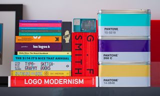
Fellow Pantone lovers! A new ‘Colour Of The Year’ is upon us (yes, it’s actually a thing), and we’ve been awaiting it more eagerly than Christmas (will someone hurry up and invent a colour of the year advent calendar?) To make things interesting we asked our designers to put their predictions, into a Pantone tin of course, for the chance at winning a block of chocolate and the bragging rights of Colour Maestro for 2016.
Pantone started in the 1950s as a commercial printing company and now holds hundreds of product and service licences in over a hundred countries. Pantone are so chill infact, that they’ve unofficially become the universal law book of consistent colour matching. And if you don’t use Pantone references, or have no idea what we’re talking about, you’ve likely enjoyed the daily coffee fix from one of their flagship colour mugs in our studio.
The Colour of The Year has been going since the turn of the millennium, gathering more and more momentum year-on-year. In the past few years we’ve seen a bold palette. 2012 brought us the zesty Tangerine colour, in 2013 we launched our MadeBrave Teal (which wasn’t far off Pantone’s Emerald choice for that year). In 2014 Pantone brought back the flower-power, painting the world pink with the rich Orchid. 2015 has seen the bold choice of the Italian inspired Marsala taking to the stage in fashion circles.
But for 2016, things took an unexpected, cheeky wee twist! On Thursday morning, we had the big reveal of this year’s Colour of The Year and were hit with a curve ball our boldest predictions couldn’t have caught – two baby-hued colours of the year. Ladies and gentlemen, welcome Rose Quartz and Serenity into your lives.
“We wanted compassion, which today a lot of people are looking for, inducing feelings of stability, constancy, comfort and relaxation to create balance in a chaotic world” – Leatrice Eiseman, Executive Director of Pantone’s Color Institute.
Our humble guesses…
Although we could never have predicted the arrival of these peaceful twins our design guru, Jade, was pretty close to bang on the money with the Rose Quartz (shout-out to hue 687!). A healthy dose of swotting up on the past decade of Colour Of The Year and noticing it was about time to move more towards pastel tones lead to the champ’s choice.
Visually we’ll maybe see next year a little softer around the edges (at least that’s what we’ll be like, after round three of Christmas pudding). Giving us the luxury of two colours, are Pantone trying to guide us a little more in colour harmony? Could 2016 see designers split the two and apply them independently or stay true to the cute couple? However it grows over the next 12 months, here’s to 2016 being painted with a more calm and relaxing brush!
You can see the 2016 Pantone Colour of the Year over on their site right here.


