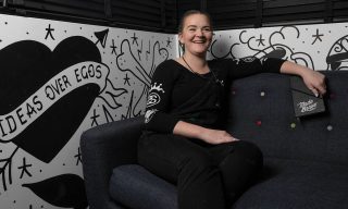
If you remember back a few months ago (aka, ‘a few days ago’ in lockdown speak), we celebrated International Women’s Day by collaborating with the incredible Lauren Morsley, creating an illustration featuring the amazing women at MadeBrave.
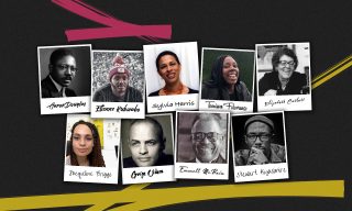
Adding to this, we partnered with Edinburgh College, inviting ten of their final year design student women to work with women across our team on a one-day creative project in our virtual (but soooo close to getting back and finally getting to see each other again in real life!) studio.
The challenge?
To lead the conversation on a social or environmental issue using the most delicious medium there is—ice cream!
And not just any ice cream. The head honchos of helado themselves and one of our top brand crushes. The one and only Ben & Jerry’s!

To kick things off, we asked the students to work in pairs to develop a new flavour of Ben & Jerry’s ice cream that related to their social or environmental issue, as Ben & Jerry’s often do. The objective was to raise awareness and increase engagement around their social issue via the supermarket shelves and beyond.
The Deliverables
First, we asked our newly dubbed artisans of ice cream to come up with a quirky name that fit the Ben & Jerry’s brand. Ben & Jerry’s love a pun (and so do we!) so we asked the students to think about how they could use humour in their name and flavour description as vehicles to build the brand, connect with their audience, and draw attention to their issue.
Being that these were design students and all, we wanted to give them a chance to, you know, design something—so we then asked them to create a mood board to hone their colour palette and design style for their ice cream carton.
Marketing Considerations
Now let’s get one thing straight—design is super duper important—but one bit that can sometimes get left out is the strategy and purpose behind the design. That’s why our Heather Robertson also did a quick chat around marketing strategy considerations to get everyone’s creative brains approaching each design through a marketing lens. You know, things like:
- Audience personas
- Customer journeys
- The marketing mix
- Objectives & results
We then asked the students to briefly verbalise these considerations during their presentations, explaining how their campaign would help drive awareness and engagement around each issue.

The Results
Throughout the day, the students worked in pairs with their sponsors from our team to deliver an attention-grabbing, positively mouthwatering cool-lection of Ben & Jerry’s carton designs. This wasn’t an easy challenge to be sure, but these students proved to us once again the age-old adage—if you put your mind to something, anything is popsicle.

“A Creaminal Nuisance”
Created by: Elia Ballesteros & Gemma Gorton
Flavour Description: Creamy vanilla ice cream with disruptive popping candy, impassible chocolate barrier, and inconvenient sour cherry bubbles
Background: This flavour was inspired by the ‘Kill the Bill’ campaign, which has been set up to protest the ban on peaceful protest in the UK. In their research, Elia and Gemma looked at supermarket shelves, considering how they could stand out from their competitors who use busy, bright, and bold colours. In response, Elia and Gemma chose a minimalist design using strong branding and bold copy that highlights the right to peaceful protest in all its forms. Each tub even comes with its own mini DIY placard with pre-paid postage that can be sent to MPs supporting the bill. Clever? Absolutely!

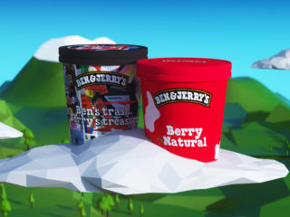
“Ben’s Trash, Jerry’s Treasure”
Created by: Rafia Mahmood & Bethany Carrick
Flavour Description: A medley of our tried and true finest flavours
Background: Every year we dump a massive 2.12 billion tons of waste into landfills and global annual waste generation is expected to jump to 3.4 billion tons over the next 30 years. This flavour would combine leftover tubs of ice cream that would otherwise be thrown out and wasted, giving customers a range of unique flavours in every tub. Surprise ice cream!? We’re in.

“Berry Natural”
Created by: Erin Spowart & Zoe Willis
Flavour Description: Chocolate core that flows through raspberry ice cream with sour jelly bits made of real fruit
Background: One in ten girls in Africa miss school each month because they don’t have access to sanitary products or private toilets at school. In Kenya alone, 50% of school-age girls do not have access to sanitary products—and believe it or not, period poverty is a problem in the UK as well. To tackle this issue, Erin and Zoe picked an eye-catching bright red colour palette with approachable illustrations and language highlighting proceeds would go to support charities that provide education and sanitary products to help fight period poverty. We loved this idea! Truly legend-dairy.

“Fudged Freedom”
Created by: Rachel Platts & Grace Black
Flavour Description: Chocolate ice cream with a funky fudge swirl and milk chocolate fashion-shaped chunks
Background: 93% of brands aren’t paying their garment workers a living wage, offering them only a tiny fraction of what designs are sold for. Besides being an ethical issue, fast fashion also negatively affects the environment. In response, Rachel and Grace created ‘Fudged Freedom’ which features a cow protesting fast fashion from behind an overwhelming mountain of discarded clothing.

“Realsome! Encourage Mint”
Created by: Illaria Veroli & Oksana Janus
Flavour Description: Fresh chocolate mint & sweet honey
Background: During the height of the pandemic, social media became, for many of us, one of the only ways to connect with our friends and loved ones. But this wasn’t all bad …right? Actually, some studies show people working from home are spending up to 5 hours per day scrolling their social feeds after 8 hours staring at a screen, often making an already anxious situation even more, well, anxious-er. This ice cream focuses on the fresh and natural flavours that encourage people to get outside in the sunshine—and let’s face it, in Scotland we need all the blue skies we can get!
And the winner is…
After much deliberation (and much freezer-raiding for ice cream, if we’re honest) our judges’ top ‘cream of the crop was none other than ‘A Creaminal Nuisance’ created by the amazing Elia Ballesteros and Gemma Gorton! Elia and Gemma both won a paid week of work experience with our design team. Nicely done! Cone-gratulations, you two!
Okay, so why did we do this?
According to the DCMS, the creative economy employs a lower proportion of women than the wider UK economy with 37.1% of jobs in the creative industries filled by women compared to 46.9% in the UK as a whole. This is despite the fact that over two-thirds of creative arts graduates are women. We wanted to do our part to help change this trend.
That’s why following presentations, several women from the MadeBrave team also hosted an open discussion sharing a bit about their own roles at MadeBrave, how they entered their careers, and some takeaways to help the students get started with their own careers.
During the discussion, the students were given time to ask questions, get involved, and offer their own thoughts, of course. We followed this with a series of one-to-ones where the students could share their portfolios and get more specific advice. And the best part is the students now have a point of contact with professional women in the industry that they can connect with.
Pretty sweet, right?


