We look back at our favourite campaigns from the last twelve months…
Well, 2015 has been quite a year: Star Wars came out (finally), we all got into fistycuffs over a black and blue dress (or was it white and gold?) and did we mention Star Wars came out? Anyway, on top of that, there have been some amazing campaigns, and being the bunch of branding geeks we are (there, we said it) here are our top picks…
UNICEF: One Shot On Cyber Bullying
“I like this hard hitter from UNICEF, showing kids lined up like a firing squad and tackling a fairly recent issue in ‘cyber-bullying’. The images are styled in an old grainy, monochrome way, which is a nice contrast to the mobile phones and the campaign message is “One shot is enough. Cyberbullying represents one of the main causes of depression and suicide among kids at school. If you have a smartphone, use it wisely, don’t kill anyone’s self-esteem.” – Asa Rodger, Graphic Designer.
Duracell – Toys Should Live Forever (Print Ad)
“This campaign is a little eery as it takes recognisable toys and presents them as skeletons. Again, a simple visual with a strong concept. It has gotten a bit of slack for being negative/dark but I think it’s great because it’s not aimed at kids at the end of the day. Reminds me of being a kid and having a beloved toy run out of battery, never to be replaced. I think these types of memories for people are what help them emotionally tie the product to the visual.” – Jade MacFarlane, Graphic Designer
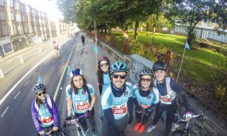
Race For Live: Join the Pink Army (TV Ad)
“It takes a different approach to charity in saying “we can work together to beat cancer” by being aspirational and giving hope to the audience without being depressing or guilting or even shocking people into donating. The voiceover is determined and gives motivation through a speech that has an overall pre-battle tone. The message is empowering for women whose life has been impacted by cancer and motivational for those who might take part in the event. It shows women of all ages, shapes and sizes can take part. The initial visuals are serious but it takes on more comical scenes as the bassy intro of Kasabian’s ‘Club Foot’ kicks in. The colour grading of the advert is quite grey and dark but this really helps the pink to appear more striking. The script is packed with brilliant and funny lines like “hell hath no fury like a women in pink”. It extends to a whole campaign, however I just think the TV ad is so memorable.” – Jade MacFarlane, Graphic Designer (she couldn’t choose between the two!)
Timberland – Made For the Modern Trail
“This is my favourite campaign of late, from Timberland. They were really struggling with sales, because people didn’t ‘get’ the proposition. Were they only for hikers or campers? Or were they a fashion brand? They were trying to be all things to people, but by re-assessing their target market they were able to come up with a really considered and well executed campaign. The ‘Made for the modern trail’ (with hashtag #ModernTrail) campaign had a clear message and was brilliantly styled. It’s a great example of a brand campaign that’s led by strategy, insight and messaging.” – Kirstin McKay, Head of Creative Projects
“Honda created these ads to advertise trading in your old car with a new Honda version. It’s particularly effective because they have made use of a modern technology reference that keeps the brand up to date. I think it was the simplicity of the idea behind this advert that captured people’s attention – very clever!” – Emma Faulkner, Graphic Designer
Water For Africa – The Marathon Walker
“I think it was the simplicity of the idea behind this advert that captured peoples attention. People train for months on end to take part in marathons and understand how hard it is, so when Sanneh (the lady in the video) walked alongside them with a sign saying some African women have to do that every single day, people could relate to it on a personal level.” – Emma Faulkner, Graphic Designer (she couldn’t choose between the two either!)
“The Burger King campaign to come together with McDonalds and collaborate for national peace day was such a good one. It was so nicely illustrated and animated, and the site that was designed specifically for the proposal had so many cool little interactions as you scrolled through. Also loved the tone of voice, had some good humour but set a good, positive example at the same time — was a shame to hear that it didn’t actually happen.” – David Shearon, Junior Graphic Designer


