Craft is a weird word.
Craft ale. Craft cheese. Craft gin.
As an adjective, it elevates the expectations of the offering. It marks something created with great care, skill and/or ingenuity. Probably in a wooden shed, by some bearded fella in a flannel shirt with permanently rolled up sleeves. A craft product is something ostensibly not made by the numbers. It’s something artisanal. Something special.
But as a verb, as in, ‘the craft of making something’, craft isn’t a single miraculous quality imbued by the strong, supple hands of a lumberjack-in-waiting. It’s the thousand tiny steps that transform ordinary words and pictures into something more.
Elevating ordinary stories
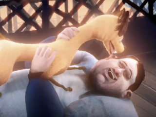
Take ‘The Bridge’. Hopefully, you’ve seen it. It tells the story of a man who is thinking of ending it all but is saved at the last minute by a friendly dog whom he then goes on to adopt. It’s a simple, heart-warming (true) story. And yet, this is one of the best examples I’ve seen recently of beautifully crafted communication.
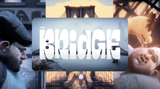
The animation by Lightfarm in Brazil is world-class. It’s unique in its look and feel—scratchy, monotone, dark, and light. It does more than just convey the mood and narrative of the film. It helps build it.
The character design stays with you after a single watch – the dog is as imperfect as the man.
The sound design is exceptional –
- The muted phone conversation at the start
- The street noises of a busy Manhattan
- Then there is the track—an emotional powerhouse of a song that perfectly reflects the story as it unfolds.
All these little elements, the clever little nuances all working together, have a massive cumulative effect in elevating an otherwise simple story.
And wouldn’t you know it, craft can also elevate a simple ad. Typography. White space. Logo positioning. They can and should all work together for maximum impact.
From concept to impact
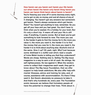
At first glance, this poster by Paul Belford just looks like a load of text. But people stopped in their tracks to read it. In its entirety.
Why?
Because of its craft.
The conceptually-driven headline that flies in the face of all headline-length “best practices” –
- Its unapologetically ‘real’ tone of voice
- The minimalist art direction
- The deliberate ‘line length’ of the copy
They all work together for a compelling and memorable message.
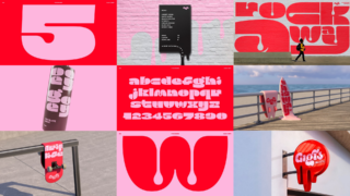
Another one to add to this list (for me, anyway), would be this brand / typographic beauty from Design Bridge and Partners.
What a simple, elegant, and delightful piece of art. How they created a bespoke typeface, and how they applied the melting effect to everything – skateboards, surfboards, signage, and menus. How they capture the sweet, sticky joy of ice cream on a summer’s day.
This is craft enjoying itself. Elevating a nice thought above and beyond the everyday.
Craft forever (and ever)
In this age of automated (artificial) intelligence, it’s easy for us to be dazzled by this shiny new creative mimicry tech and overlook what really elevates our work and gets people to sit up and take notice—real people doing real work. Craft is and always will be the differentiator. And in a world flooded with AI content, craft will always be ‘on trend’.
