Colourful and creative, Pantone’s got your colour pallet pegged!
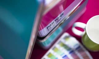
Pantone is the universal bible for colour across design, interiors, fashion, print, web and more.
As creators it’s our first language for communicating colours consistently. It’s a privilege to own a suite of swatches you can fan out and thumb through for consistently reproducing colours.
But sometimes the best inspiration creeps up on you when you’re not quite ready for it – and a lot of the time it can float out of our minds as quickly as it came in. Luckily, now we have tiny little super-computers we all walk around with in our pockets all day, so this happens less and less.
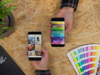
Technology’s bridging the gap of right time, right place. There’s always an app to turn to: when you want to save a sliver of wisdom a taxi driver casually dropped, it’s Evernote. When you need to find a moment of peaceful reflection on a crowded train, Headspace is the one. The most successful apps in Apple’s chart allow us to create or consume on the move – which is exactly what Pantone’s new Studio app does, thanks to it packing the entire Pantone library of colour into the palm of our hands.

Pantone’s latest app is not revolutionary; there are plenty on the market that let us grab photos of the world around us and build palettes from them, but it is better. It’s key benefit is integration – Studio lets you capture a photo instantly and tweak the pointers to fine-tune the colour scheme to values which will be available in the Pantone Universe. It then gives you a breakdown for CMYK (print) and RGB (screen) and sends it to your Creative Cloud Library for desk/laptop access, all quicker than you can say ‘Adobe Photoshop’.
For the hobby colour-enthusiast or stylish fashionista, the tool can be really fun for digging up inspiration. We admit to letting curiosity get the better of us from time to time, and can now take weird comfort in knowing which Pantone references Dexter, our Studio Barketing Manager, falls under (that’s Pantone 241 for anyone after some dog-coloured inspiration. Nope? Just us?).
Ultimately it’s a nifty app which can speed up workflow (hail, hail!) or catch and bottle inspiration when it strikes. At the same time Pantone Studio lets you have a little fun stumbling across striking colours for what could well be 2017’s Colour Of The Year, or your weekend get-up.
By the way, we were pretty close on the 2016 prediction. Come have a look-see!


